Thiết kế bộ nhận diện thương hiệu/ Brand Identity Design
Cara Design x LDD
—————————–
LDD là một doanh nghiệp đa ngành, cam kết mang đến giải pháp và dịch vụ chất lượng cao cho khách hàng. Doanh nghiệp thương mại LDD không chỉ là một tổ chức kinh doanh, mà còn là một hành trình đầy ý nghĩa, nơi sự sáng tạo và đổi mới gặp gỡ với những giá trị cốt lõi mạnh mẽ. Chúng tôi tự hào là đối tác đáng tin cậy của khách hàng, mang đến những giải pháp độc đáo và chất lượng cao, đồng thời tạo ra những trải nghiệm đắng cấp và không ngừng phát triển.
(LDD is a diversified business, committed to providing high-quality solutions and services to customers. LDD is not just a commercial organization; it is also a meaningful journey where creativity and innovation intersect with strong core values. We take pride in being a reliable partner for our clients, delivering unique and high-quality solutions while continuously striving for excellence and growth.)
Cara Design x LDD
#Concept
Quá trình sáng tạo trong thiết kế logo cho doanh nghiệp LDD là một hành trình phức tạp, đòi hỏi sự sáng tạo, nghiên cứu kỹ lưỡng, và tương tác chặt chẽ với khách hàng của đội ngũ Cara Design.
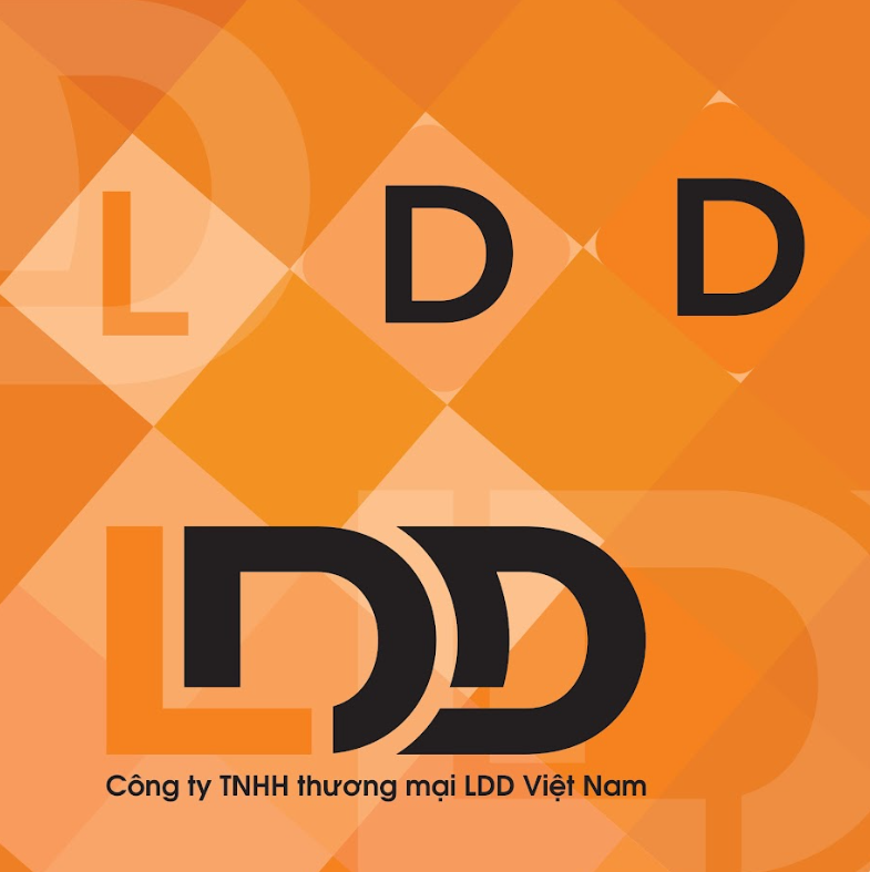
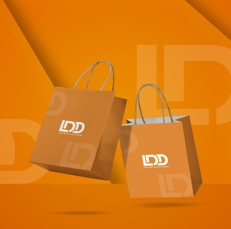
Màu cam được chọn làm màu chủ đạo, không chỉ vì sự nổi bật mà còn vì ý nghĩa của nó trong ngôn ngữ màu sắc. Màu cam thường biểu hiện sự năng động, sự tươi mới và sự sáng tạo. Nó gửi đến khách hàng thông điệp về sự nhiệt huyết và tính độc đáo của doanh nghiệp. Hơn nữa màu cam và đen kết hợp với nhau tạo ra một tổng thể hoàn hảo, tăng cường sự đối lập và đảm bảo rõ ràng cho người xem.
Để logo có thêm sự sáng tạo, thu hút, Cara design đã sử dụng một kiểu chữ độc đáo, phông chữ hiện đại để thể hiện tính cá nhân và sự đặc biệt.
(#Concept
The creative process in designing the logo for LDD business is a complex journey that demands creativity, meticulous research, and close interaction with the Cara Design team.
The choice of orange as the dominant color is not only for its eye-catching quality but also because of its significance in the language of colors. Orange often represents dynamism, freshness, and creativity. It conveys a message to customers about the enthusiasm and uniqueness of the business. Furthermore, the combination of orange and black creates a harmonious whole, enhancing contrast and ensuring clarity for viewers.
To infuse the logo with additional creativity and allure, Cara Design employed a distinctive typeface—a modern font that reflects individuality and uniqueness.)
Cara Design x LDD
#Visual
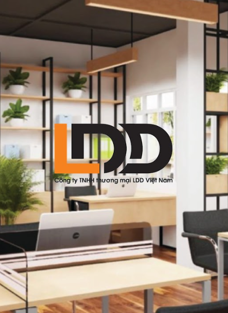
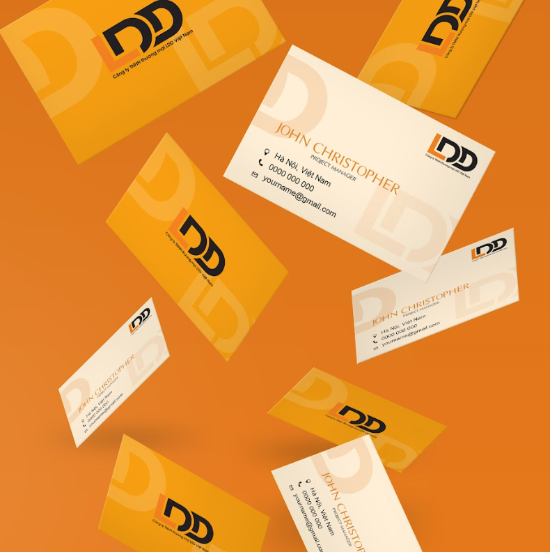
Visual của doanh nghiệp LDD mang đến sự tươi mới, năng động và hiện đại, đồng thời linh hoạt và dễ nhận biết ở mọi kích thước và ứng dụng khác nhau. Hình dạng của logo nên đơn giản để dễ nhận diện và hiện đại để phản ánh sự tiến bộ, sử dụng đối lập giữa chữ và hình ảnh để tạo điểm nhấn và thu hút sự chú ý.
Quá trình này cần sự cân nhắc kỹ lưỡng và tương tác chặt chẽ với khách hàng để đảm bảo rằng logo phản ánh chính xác giá trị và tầm nhìn của thương hiệu.
(#Visual
The visual identity of the LDD business exudes freshness, dynamism, and modernity, while remaining versatile and recognizable across various sizes and applications. The logo’s shape should be simple for easy recognition and contemporary to reflect progress. By juxtaposing text and imagery, we create focal points that capture attention.
This process requires meticulous consideration and close interaction with clients to ensure that the logo accurately reflects the brand’s values and vision.)